Narrative Structure Tutorial
Three Classic
Narrative Structures
The three classic narrative structures in library data storytelling—transformation, continuity, and discovery—draw from major theorists in narratology, literary criticism, folklore, and semiotics. These frameworks interweave a story's informational content with its emotional impact in one coherent experience.

These structures describe most stories told by nonprofit organizations and institutions. Each approaches the story differently, evoking specific emotional responses while conveying essential data. Understanding the nuances of these narrative structures allows storytellers to craft more effective advocacy messages tailored to their specific goals and audiences.
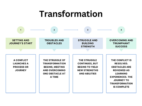

Transformation
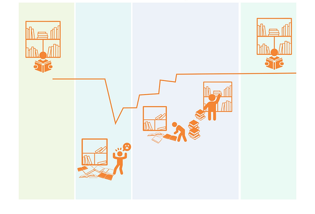
Transformation narratives follow the classic hero's journey structure, chronicling triumphant change after significant challenges. As Campbell (1949) noted in his analysis of heroic narratives, transformation requires both challenge and assistance. These stories highlight obstacles overcome and celebrate remarkable achievements, creating a sense of awe and inspiration. In fundraising campaigns, transformation stories showcase how donations enabled the library to convert aspirations into tangible improvements. While compelling, transformation narratives should position the library not as the hero but as the essential helper - the guide who provides resources that empower community members to become heroes in their own journeys.The emotional impact stems from witnessing awe-inspiring feats accomplished through perseverance, such as a literacy program that dramatically improved outcomes for struggling readers. Transformation stories work best when they foreground human achievements and demonstrate how library resources catalyzed meaningful change. Libraries are not the hero, but they are part of the hero's journey as a helper.
Continuity
Continuity narratives celebrate resilience and persistence through cycles of change, highlighting what endures despite disruption. Drawing from Todorov's (1969) equilibrium theory, these stories trace journeys from stability through challenge to renewed equilibrium. Library continuity stories might showcase how services adapted during technological revolutions while maintaining core missions, or how century-old reading programs evolved while preserving fundamental literacy values. These narratives evoke feelings of reassurance and stability, based on institutional dependability across generations. However, continuity structures also effectively illustrate persistent fights against specific social problems—such as segregated neighborhoods with unequal library access or ongoing funding disparities affecting service delivery. By showing what remains constant (whether positive achievements or troubling inequities), continuity stories provide context for understanding both institutional strengths and areas needing advocacy for change. These stories connect past and present, helping audiences appreciate the library's enduring relevance while recognizing opportunities for better futures.

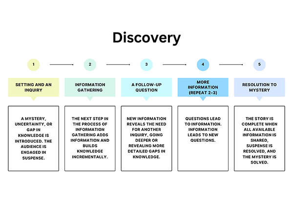
Discovery
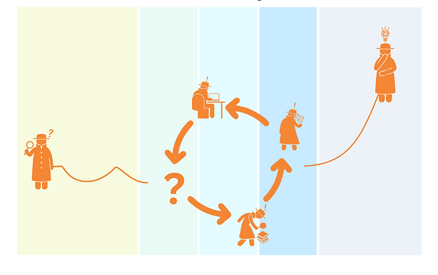
Discovery narratives are about exploration. They harness curiosity and the impulse to investigate, revealing unexpected insights about library services and community needs. Based on Barthes' (1970) concept of the enigma code, these stories create intellectual suspense as audiences follow an investigative journey toward understanding. For example, a discovery story starts when librarians notice disconnects between program attendance and card registrations, and the story develops with a survey to understand why people attend but don't register for library cards. This kind of story might also emerge from a collaborative community mapping process, where groups striving to serve underserved neighborhoods come together and research their communities; that research then exposes transportation challenges that limit access from those neighborhoods to physical library resources. Unlike transformation or continuity stories, discovery narratives don't require neat resolutions—they thrive on questions, exploration, and new insights. The emotional experience resembles a mystery unfolding, with satisfaction coming from newfound understanding rather than triumphant outcomes. Discovery story structures are excellent for describing the journey of collaborative problem-solving, inviting participants to share the excitement of unexpected findings, such as uncovering unrecognized community needs or identifying untapped resources in the budget. These stories create momentum for innovation by framing challenges as intriguing enigmas that deserve sustained investigation.
S-DIKW: A Step-by-Step Approach from Data to Story
DIKW stands for data, information, knowledge, and wisdom. The DIKW pyramid appears regularly in information studies textbooks as one of the most fundamental, widely recognized, and taken-for-granted models for understanding information conceptually (Rowley 2007). T.S. Eliot is often credited with inspiring DIKW with his 1934 poem “The Rock”: “Where is the wisdom that we have lost in knowledge?/Where is the knowledge that we have lost in information?” DIKW has alternately been called the information hierarchy, the knowledge hierarchy, or the wisdom hierarchy. While there have been multiple ways of understanding and visualizing DIKW, the set and sequence of four levels remains: data, information, knowledge, and wisdom.
The S-DIKW Framework (S for storytelling) adapts DIKW for practical applications in data storytelling (McDowell 2021). Each level of the framework relates to human abilities to derive stories from data, to interpret data with context as information stories, to take action based on those information stories, and to enact wisdom based on what they know.
-
S-Data: Basis of information in story
-
S-Information: Data interpretation with context as story
-
S-Knowledge: Actionable information in story
-
S-Wisdom: Which story to tell when, how, to whom, and more
The S-DIKW framework can be used to transform raw data into a data story.
Click to investigate each level.
S-Data:
Extracting and Representing Relevant Facts
More complex data storytelling needs supporting data visualization. The translation from data to story starts with data, perhaps with a simple visualization like a chart representing an insight extracted from raw data. Then, the visualization (or other representation of data) is enriched with new elements as it transcends into the levels of information, knowledge, and (ideally) wisdom. Before representing data in narrative or visuals, data storytellers should ensure they have permission to represent them. In addition, data should be of high quality, respect data privacy policies, and be as fair and non-discriminatory as possible (Dykes 2020). Data that represent people deserve additional consideration so that they cause no harm to anyone they represent.
Choosing data points depends on the purpose of the story. S-Data is the visual representation of a relevant fact or facts as represented in data. A relevant fact is something worth telling through a story, something that people will want to know. Transforming data into S-Data means building the main scene of the data story, which can be represented through a clear chart.
Various data analysis techniques can be applied to extract relevant facts from data, such as descriptive statistics, inferential statistics, data mining, and machine learning. These techniques enable the identification of patterns, relationships, and trends within the data, making them informative to an audience.
Depending on the analyzed data type, different techniques can effectively represent data visually. For quantitative data, common chart types include bar charts, line charts, scatter plots, and histograms. Qualitative data is often represented using charts like pie charts, stacked bar charts, and word clouds. These visual representations provide a concise and intuitive means of conveying information, facilitating comprehension and interpretation.
For example, imagine that a library has seen slow but steady decreases in donations over the past five years. This trend could be represented as a line chart supplemented by the raw data of the highest donation amount—five years ago—and the lowest dollar amount from the current year. A question from a recent survey might result in a bar chart of responses as to why people do or do not donate to the library. A series of choropleth maps might indicate where donors and, by sharing each map sequentially, could show where people most or least likely to donate have lived over the past five years.
